

Hi Creative Friends,
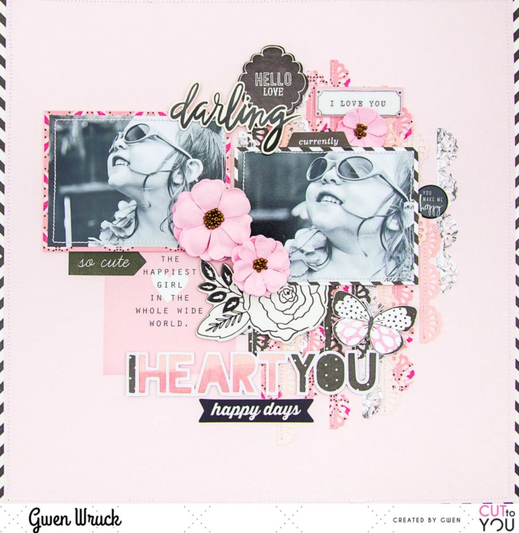
I’m up on the CUT to YOU blog today with a new share, this one featuring one of their TITLE style digital cut files and an older picture of my little miss! I’ve gone with a monochromatic colour scheme for this page, and it’s one of my favourites, black & white plus pink!
CUT to YOU has a huge range of digital and custom cut files that are designed as titles for your pages, you can check them all out here.
I’ve used the ‘I Heart You‘ design. I cut it as it is on my Silhouette and then with my fussy cutting scissors, trimmed off the heart shapes as I wanted just the text for this page design.
To create the page, first up I cut thin strips of pattern paper in various shades of Pink. Then, using my border punch, punched down one side. I’ve layered these all up on my background and then stitched along one edge.

Next, I went about matting my two photos, I’ve mixed up the pattern paper for these, not only because I wanted an eclectic vibe to the page, but also because I was using up lots of bits and pieces from my stash. These are my most favourite pages to make; you take a few bits & pieces which really amount to “not much” and turn them into something special.

I positioned my photos onto my background, slightly covering up the paper strips, they are acting as a base for my page. I then went about backing the cut file. For this, I’ve used two pattern papers and alternated down the words in the file. I’ve chosen darker paper for this to help the white outline of the design stand out. I mounted the file with some 3D foam to raise it up from my background and positioned on my page.

Now it was time to dig through my stash for some embellishing pieces. The first thing I found was this cute 3×4 journalling element with the quote “The Happiest Girl in the whole wide world” and I thought it was perfect for this page, so on it went! Next, I went on the hunt for some black and white elements to coordinate with the black and white images.

I found this perfect chipboard floral piece from Maggie Holmes and a stack of other elements from a wide variety of collections and manufacturers and they all go because of their neutral black and white colour scheme. I just kept digging through my stash finding and auditioning pieces here there and everywhere on the page until I was happy with how it was looking.

I’m really happy with how this turned out and love how the digital cut file design for my title came together. I love how it works with all of the other elements on my page and It’s actually really nice to have a title sorted for my page without a lot of thinking about it!
You can see the latest designs from CUT to YOU here, and their selection of Title & Words here.
Until next time,
