I HEART YOU | CUT TO YOU

Hi Creative Friends,

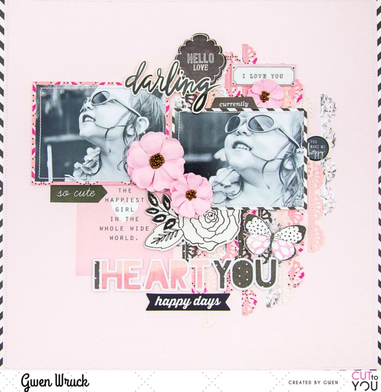
I’m up on the CUT to YOU blog today with a new share, this one featuring one of their TITLE style digital cut files and an older picture of my little miss!  I’ve gone with a monochromatic colour scheme for this page, and it’s one of my favourites, black & white plus pink!
CUT to YOU has a huge range of digital and custom cut files that are designed as titles for your pages, you can check them all out here.

I’ve used the ‘I Heart You‘ design. I cut it as it is on my Silhouette and then with my fussy cutting scissors, trimmed off the heart shapes as I wanted just the text for this page design.

To create the page, first up I cut thin strips of pattern paper in various shades of Pink.  Then, using my border punch, punched down one side.  I’ve layered these all up on my background and then stitched along one edge.

Next, I went about matting my two photos, I’ve mixed up the pattern paper for these, not only because I wanted an eclectic vibe to the page, but also because I was using up lots of bits and pieces from my stash.  These are my most favourite pages to make; you take a few bits & pieces which really amount to “not much” and turn them into something special.

I positioned my photos onto my background, slightly covering up the paper strips, they are acting as a base for my page.  I then went about backing the cut file.  For this, I’ve used two pattern papers and alternated down the words in the file.  I’ve chosen darker paper for this to help the white outline of the design stand out.  I mounted the file with some 3D foam to raise it up from my background and positioned on my page.

Now it was time to dig through my stash for some embellishing pieces.  The first thing I found was this cute 3×4 journalling element with the quote “The Happiest Girl in the whole wide world” and I thought it was perfect for this page, so on it went!  Next, I went on the hunt for some black and white elements to coordinate with the black and white images.

I found this perfect chipboard floral piece from Maggie Holmes and a stack of other elements from a wide variety of collections and manufacturers and they all go because of their neutral black and white colour scheme.  I just kept digging through my stash finding and auditioning pieces here there and everywhere on the page until I was happy with how it was looking.

I’m really happy with how this turned out and love how the digital cut file design for my title came together.  I love how it works with all of the other elements on my page and It’s actually really nice to have a title sorted for my page without a lot of thinking about it!

You can see the latest designs from CUT to YOU here, and their selection of Title & Words here.

Until next time,

CUT to YOU for Cocoa Vanilla Studios

Hi Creative Friends,

Boy, do I have something exciting to share with you today!  I am super proud and excited to announce the very first “CUT to YOU for Cocoa Vanilla Studios” cut files!!! That’s right, I’ve been working with Zoe from Cocoa Vanilla Studios to create a special set of cut files, inspired by her gorgeous designs that will complement the stunning “Happiness” collection.  What’s even more exciting, you can get them for FREE!!! That’s right, find them here for FREE.

Happiness CUTFiles

AND… of course, I wanted to share my very first page using the files!!

As soon I saw the collection, I was drawn to those signature florals of Zoe’s… she really does know how to make floral designs, I knew straight away I wanted some floral cut files to go with them!  I went about simplifying her floral shapes to create a set of roses and leaves and these are the files I worked with for this page.  I simply cut them out super large and used the mirror feature on my Silhouette Cameo 3 to make one of them a mirror image for added interest.

I then went about backing the files, for this, I’ve used the “Meadow” paper which has this divine pink watercolour ombre effect and the brown on the leaves is from the “Bright & Beautiful” paper.  Once backed, I simply added to my page along the right-hand side running from the top to the bottom.  I just love the statement these make!

Next, I found the same “Meadow” paper in the 6×8 paper pad and mounted my photo.  I’ve also added my signature stitching, I don’t think I could ever miss that out!  I’ve positioned it on the left at the bottom of my page.  I want the roses to be part of the design, but I don’t want to cover them up very much, they are just so so pretty.

Now all that was left to do was add in some embellishments and my title.  I’ve gone pretty simple with the embellishments, fussy cutting out some butterflies from the “Bright & Beautiful” paper and adding some die cut element from the ephemera pack.  The title is from the Die Cut Titles pack and I’ve positioned at the top of my page to balance out the photo.

I’ve also added a flair button down by my photo, I love the pop of black here and it balances out my title nicely as well as adding a little interest to that simple cluster.  AND…. that was the page done, and why I love working with cut files oh so much!  They really help you lock in a layout for your page which helps the pages come together really quickly.

Now, if you haven’t already, go get yourself a set of the FREE cut files which you can grab here and then, get creating!  As always, be sure to show me what you make, I really love to see! #cuttoyou #cocoavanillastudio

Until next time,

BEAUTIFUL GIRL | SUGAR & SPICE | GWEN WRUCK

Hi Creative Friends,

I hope you are all doing well!  I’m up on the Cocoa Vanilla Studios blog today with this sweet page of my daughter Caitlin.  For this layout, I’m using the Sugar & Spice collection for Throwback Thursday!  I just love these features, I get to dig deep into my stash and come up with fresh inspiration from an older Cocoa Vanilla collection.  For this layout, I’ve gone all the way back to the start of 2015 and one of the very first Cocoa Vanilla collections.

The inspiration for the page most definitely started with the collection.  I pulled out all the bits and pieces I had and took in the pretty soft colours.  I had a full sheet of the Journal Cards paper as well as the Dot to Dot paper and a couple of sticker sheets from an original collection pack. I also had some paper scraps, very small pieces though.  I then got to thinking about adding a cut file and remembered that there were designs released with the Colour Me Happy collection from 2016 so went about cutting some of those out on some plain white cardstock from my stash.  You can shop them here.  There are florals and titles and lots of super fun elements, well worth checking out!

At this point, I had a clean white background and some fresh cut files also in white.  I love a border on all of my layouts, so I began by cutting out the centre of the Dot to Dot paper and using the centre part to mat my photo.  The outer edge became the frame for my page.  I double matted the photo using a paper scrap of the Candy Stripes paper.  I then positioned the cut files and my photo getting the base of the design locked in.

Next, I went about finding a coordinating element from the Journal Cards paper, I’ve gone with the element that says “Beautiful Girl”, not only because of it’s colour, but the sentiment is perfect as well.  I’ve positioned that to the left of my photo, I love how it runs horizontally the same way that my photo does.  It really helps draw the eye across the page.

I knew I wanted to use a lot of the sticker elements on my page, mainly because I had so many compared to how much pattern paper I had left, you really do get a lot of elements on these sticker sheets.  I decided to really roll with the floral elements, adding them to my page to build on the feature of the cut file.  I essentially created one large cluster down the right-hand side of the page.  Some of the flowers I have mounted onto foam for dimension, others I’ve added directly to the page.

I then went on to add some of the sentiments from the sticker sheet, again using foam tape for some for dimension and interest.  I took the large sentiment ‘Beautiful’ and used that as a subtitle for my page tucked underneath the journal card and photo I positioned earlier.  I’ve also used the cute banner pieces and added some stitched detail to make my banner pop.

I was really happy with how this was all coming along but felt the page needed grounding.  It felt like it was a bunch of elements just floating in the centre of the page.  So, I took the long border strip from the Accessories Sticker sheet and trimmed a small piece from one end.  I positioned the small piece on the left of my page and the larger piece on the right-hand side.  I found this helped draw the eye from my photo on the right down and across the page past my title to the left.

At this stage, the page needed a few small finishing touches, so I’ve added in some tiny hearts, again from the sticker sheet.  I then also, grabbed a couple of very small scraps and using a steel roll die from my stash, made a paper bow, it was the perfect finishing touch.

Thanks for popping by today, I just love how this page turned out!  I hope it encourages you to dig into your stash and create something with an older collection.  If we use up the older stuff, we feel so much better about getting all the new things right?

Until next time,

WEEKEND VIBES | CUT TO YOU

Hi Creative Friends,

I hope you are all well!  I’m up on the CUT to YOU blog today with a share featuring one of our brand new cut files, only released last night!  Being the designer, I do get a few privileges and that is first access to the latest designs… I mean, someone has to test them all out right, before they get shipped off to new homes! 🙂  This is one of my most favourites ever, so it went straight onto a page!

Here is the cut file… fresh from release, you can grab it here.

To create my page, I started by backing the hot air balloon.  I did cut it very large, as I knew I wanted it to be a real feature on my page, so backing it was pretty easy.  I did mix up the pattern papers a bit just for added interest, but you could absolutely do the balloon in just one pattern paper to make it easier and I know it would still look great!

Next, I added my mat to my photo and stitched around the edge, and then went on to position it on my page.  I wanted my daughter to be facing in towards the centre of the page, so the balloon had to go on the right-hand side and as it turns out the ribbon on the basket was on the right-hand side too, which worked out perfectly!

Next, I wanted to add some subtle interest to the background of my page.  To do this, I’ve cut out the clouds in the cut file on white cardstock and positioned flat onto the background for a white on white effect.  I love the subtle result, soft like a cloud.

It was now time to work on my title.  It actually started with the cute flair button with the words ‘Weekend’ on it.  This photo was just a happy snap taken at a park on a regular weekend, so I went with “Weekend Vibes”.  We used to do this so much when she was little.  Now that she’s a ‘tween’ it’s a little harder to get her out of the house!!

I then went digging through the Die Cut Ephemera pack to see what other elements I could add to the page, it didn’t need much at this stage, just a few little touches.  I’ve gone with some more word sentiments, some pretty florals and butterflies.  I’ve also added in some of the ‘Accessory Stickers” to build on the sentiment in the title and round out the page.


Thanks for popping by today and seeing our latest release cut files in action AND for your support of CUT to YOU.  Release after release I’m not only blown away by the lovely comments I get about the new designs but also by your support by purchasing them and using them on your projects!

Our  Facebook group is always full of inspiration because people like you share your makes, so THANK YOU!

Until next time,

“Hello Happy” for Scrap the Girls April 2019

Hi Creative Friends,

April is here and it’s time to share another fab challenge at Scrap the Girls.  This month we are being inspired by this image and to scrap more images of ourselves, in which we feel empowered and beautiful.

and here is my layout!

This selfie is really special to me.  It’s just a quick photo taken before morning ballet class, but what it represents is so much more!  I have spoken a little before about my love of ballet and how I did it as a child and how I am now back at the barre after over 20 years break!  Being able to dance again has been so so great and it really does help me be the best me I can be.  It helps me mentally and physically and I’m so so blessed to be able to do it!  So… having said all that, this page for me, is about creating your own happiness and not looking to others for that AND to love yourself enough to make it a priority!

The idea for this page actually started with those 3 wooden frames.  They had been sitting in a bowl on my desk for the longest time and I was on a mission to get them stuck onto a page!  So, I actually positioned them first. Next, I went about choosing my photos and mounted them with pink cardstock and stitched around the edge.

Next, I pulled out the cut file; this one is called ‘All Around Floral‘ from CUT to YOU.  It too was sitting on my desk waiting for a page, so I placed it over the frames but flat to my background pattern paper.  This then gave me a framework to work with for the page design.

Now that my photos, the frames and the cut file were all locked in place, I worked on adding my title and embellishments.  I went with themes that matched the mood-board that added to my sentiment of being empowered to create my best life.  I love that I found a piece that says “Own your happy” it’s so true and a perfect fit for this page.  I’ve added some other cute elements such as the swans, not just because they are cute, but also because they reference Swan Lake (one of the most recognisable ballets there is). Oh yes, and gold puffy hearts, because Gold, because puffy and because hearts 🙂  AND, that was the page all done!

Another page I absolutely love, thanks for popping by and allowing me to share it with you.  I do hope you’ll play along with the challenge.  You need to upload to the Facebook group by the end of the month for your chance to win a prize pack from this months sponsor.

This month’s sponsor: Charm Creations.

Until next time,


error: