BEAUTIFUL MOMENTS | MIDNIGHT | GWEN WRUCK

Hi Creative Friends,

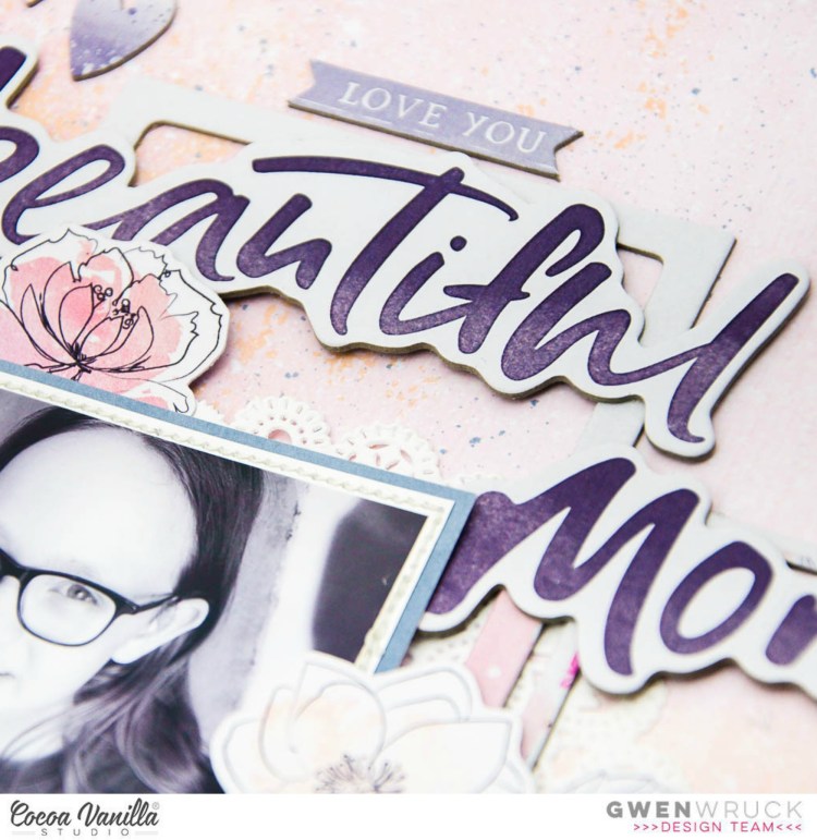
Here today to share my latest Cocoa Vanilla Studios project and it’s another with the beautiful ‘Midnight’ collection.  I was so drawn to the ‘Moonlight’ pattern paper in the collection it was the starting point for my project today.  I wanted to document this photo of Miss 11 on a recent visit to “Yoghurt land”, she is totally obsessed and I can understand why; if you haven’t been, you simply must!

Ok, with the background paper chosen and my photo, I wanted to team it with something a little darker and pulling out the blue/grey tones in the collection.  The ‘Inky Depths’ paper is perfect for this, and being ombre and not patterned as such, it didn’t compete with the mixed media background paper.  I’ve used it here to back my photo as well as a 1/4 inch border around my page.  I do this A LOT and love to add stitching around the edge as well.  I really like how the border finishes off the edges of my page.  For something different, I’ve made the ombre run from left to right on my page (rather than top to bottom); I’ve done this because the design of the page runs across, so it helps lead your eye across the page when everything is running in the same direction.

I then went through the ‘Chipboard Pieces’ pack and pulled out the frame elements.  There are two in the pack which are separated by a piece of chipboard which I have used as the third frame on my page.  I’ve positioned them across the centre of the layout positioning them above and below my photo and on the right-hand side. I’ve also added in a doily from my stash for texture and once happy with their position stuck down with a little liquid adhesive.

I wanted to sort the title next.  The bold chipboard title pieces are lovely to work with but they are quite large; by locking them into a position early, I’m making sure they ‘fit’ with the design of the page.  There have been times when I’ve left them until much later in my creative process and then found they don’t ‘fit’ anywhere, so locking them in early is my hot tip for those.  I decided to position them along the top edges of the top two frames, this really helps them feel part of the main elements as well as adding an extra layer of dimension.

I then went to the ‘Die Cut Ephemera’ pack and pulled out all of the floral and leaf elements.  I’ve used these to build a flower cluster on the left and right of my photo.  I’ve simply slotted them behind my photo and added 3D foam tape behind some elements for interest.
I was really happy with how this was coming along at this stage, just a few more elements and I could call it done.  I pulled out a tag and banner from the die cut elements pack as well as some hearts and the ‘my darling’ banner from the chipboard pack.  I’ve added these around the main cluster in places that needed a little extra touch or to fill a gap in the design.

To finish out the page, I’ve added in a flair button from the ‘flair pack’.  I must admit I’m hoarding that sweet girl flair, how darling is she!!  I do love how a flair can finish off a page and add the perfect element to a cluster, they have been around for a bit, but I still love them.

Thanks for popping by today, heaps more ‘Midnight’ inspiration to come, I think I’ll be creating with this collection for a while yet!

Until next time,

HAPPY HEART | MIDNIGHT | GWEN WRUCK

Hi Creative Friends,

Here today to share my latest Cocoa Vanilla Studios project AND… it’s my first page using the stunning new collection ‘Midnight’.  I’m already totally in love with this collection, the florals are totally swoon-worthy and I couldn’t help but feature them on my first page along with a happy snap from a recent girls trip to Melbourne for fun, food, wine and shopping!

Before I had even decided on the design for this page, I went about fussy cutting.  I love doing this while watching TV or while waiting for Miss 11 at school pick up, it’s really therapeutic for me.  I cut out all of the large flower clusters I could from the ‘Bloom & Grow’ pattern paper.  You could also do this with the ‘Sophisticated’ paper which is a similar design in Black and White. They are actually quite quick and easy to cut out as their design is elegant and simple.

I then went about finding a paper for my background.  Those of you who know me know that I love the look of mixed media without the mess so the ‘Inspired’ paper was the perfect choice for a mixed media background with all the hard work done for me, thanks, Zoe!  I let the design of the mixed media dictate my page, starting with one of the flower clusters in the upper left-hand corner and then working them towards the centre of the page and down towards the lower right-hand side allowing the eye to be drawn from those small black spots on the background from the left to the right.

Once I was happy with the floral placement, I added a touch of glue underneath to keep them in place.  Next, it was time to position my photo.  To create my photo mat, I’ve taken a piece off of the’Sunset Strip’ paper, how stunning is the ombre on this paper!!!  I cut it in three places and then just layered each piece behind my photo.  I then positioned it on the left between the edge and my florals, making sure not to cover those beauties up!

The bones of the page were now sorted, time to add in my title.  There are ohh so many choices for titles in this collection including chipboard pieces and cardboard die cuts.  I went with the die cuts for this page that say ‘Happy Heart’ and raised them up on some 3D foam tape.  There are so many things about this photo that makes my heart happy.

To add in some finishing touches, I went through the die cut ephemera pack and found some other pieces which were perfect including a circle element that says ‘love this’ and a heart shape and a banner.  I also found a number of die cut florals which I’ve added into my paper bouquet as well as a chipboard floral piece.  It’s really fun to build a floral cluster like this, it can have as many layers and pieces as you like.  I also found a bunting in the chipboard pack and added that at the bottom of my cluster which really helps draw the eye across the page.

Last but not least, I’ve added the heart design flair button and have to say, I’m super happy with how this all turned out, it really is a fun collection to create with and I do love a pretty floral.

Thanks for popping by today, and I hope this has inspired you to get to your local retailer and grab some of the Midnight collection, it’s even more beautiful in real life and I know you’ll love it!

Until next time,

FINE & DANDY | CUT TO YOU

Hi Creative Friends,

I hope you are all well this fine Thursday.  I have a new share for today, this one using one of my CUT to YOU digital cut files featuring a pretty snapshot of my baby girl from a few years back.  She adored this dress up costume so I have a few pics of her in it; many I have already scrapped.  So for this page, I wasn’t really that focused on the story, I just wanted to make something pretty.

For this page, I’ve used the Peonies digital cut file, yes, this comes as a custom cut, but for my design idea, I wanted the shape to be really large.  That is the beauty of using the digital version of the files, you can manipulate them in lots of different ways to make your project unique.  I’ve taken the file and enlarged it using my Silhouette software as I wanted them to be a real feature of the background of my page.

Next came the backing of the files.  For this, I’ve used the Bohemian Dream collection by Cocoa Vanilla Studios.  The pink and purple tones in this collection go perfectly with my photo, so I thought I’d make some pretty pink and purple Peonies!  You will see in the close up’s that I’ve also used some Vellum to back the outer edge petals of the files which really adds a softness that I love!

Once the files were backed with the pattern paper, I positioned onto my background page and stitched around the outer edge of my page.  Next, I matted my photo and added some more stitching around its edge for added detail.  It was then just a matter of pulling out embellishments from the collection that fitted.  I kept to this collection only for this page as I wanted to get something completed quickly and knew everything would work together really well.

To keep the design simple, I have run the embellishments from the top of the page to the bottom which also leads the eye down to my photo.  I’ve kept large areas clear to create some white space in the design which helps the elements on the page to pop.  Yes, this is a pretty simple page, but I still love it so much.  I love the detail the cut files added to the background and the layer of vellum to the outer edge of the petals especially (I’ll definitely be doing that again!)

For more information and loads more cut files, visit www.createdbygwen.com.au where you will find both digital cut files (you download and cut with your electronic cutting machine) and custom cut files which I cut for you at CUT to YOU HQ and ship anywhere in the world! Simply message me for a postage quote.

Also, why not join our Facebook group – CUT to YOU HQ for more inspiration from the design team and lovers of our files.  Lots and lots to see here!

We are now on Pinterest – visit us here.

Until next time,

SO HAPPY | LOVE ALWAYS | GWEN WRUCK

Hi Creative Friends,

Here today to share my latest Cocoa Vanilla Studios project and this week on the blog we are featuring stickers on our projects.   I love what the design team have shared already, so if you haven’t seen their projects, be sure to check them out.  There really are so many stickers in the ranges to choose from I wasn’t sure where to start, so I went to one of my all time fav collections; the ‘Love Always’ collection to document this sweet photo of my daughter.

To begin the page I started with a cut file, this is one that I have designed for CUT to YOU.  I wanted to use a background file for this page with the plan that the rest of the layout would be simply a photo mat and then lots of pretty embellishments, a great strategy for getting pages done fast!  I also knew at this point that I wanted to use a pretty large title so needed to keep space for that.

I’ve used the ‘More than Words’ pattern paper ‘Darling Buds’ to back the cut file.  I also took quite a bit of time to add a lot of stitching, but I do think it’s worth it!  I’ve used ‘Noteworthy’ from the same collection to mount my photo.  For this, I’ve used the A and B side to create 2 separate photo mats.  I popped all of this onto foam for added dimension, seeing this is going to quite a simple design and the cut file is so flat, mounting the photo is a good option.  Before adding to my background, I grabbed a white doily from the ‘Love Always’ Bits and Pieces pack and added behind the stack.

Now its time for the stickers!  I started with the Chipboard Title Stickers from the ‘More than Words’ collection. I love these for their dimension AND they really are nice and sticky, no need to add any extra adhesive, as their name suggests, perfect for your page title.  They are also a really lovely soft dark grey, which I love!

Next, I had a little dig through my stash and found this ‘BEAUTIFUL’ sticker on the ‘Hello Lovely’ Accessory Sticker Sheet which was the perfect fit.  For dimension, I added some foam tape underneath.  Next, I pulled out  the ‘Love Always’ Accessory Stickers I’ve used here the tab on the left side of my photo mat, it really just adds a little touch to the paper layers and if you are super thrifty like me, you can cut them in half lengthways and get twice the use out of them!

Deep in my stash, I also found some fun wood veneer elements, this ‘hello’ is from the ‘Colour Me Happy’ collection Wood Veneer Words.  As you can see below, it fits snugly under my popped up sticker and completes the subtitle of the page – Hello Beautiful.

I then went back to the ‘Love Always’ Bits and Pieces pack and pulled out some sparkles, and a flower to add to my embellishment cluster.  I’ve also fussy cut out some heart elements from the same collection and added to my page.  Their geometric design fits well with the geometric cut file.

To finish out the page, I pulled some of the typed stickers from the ‘Love Always’ Accessory Stickers sheet, there is a stack on here, all very sweet sentiments.  I’ve added foam under these as well for dimension and added around my page.  Lucky last, I die cut out a bow to add to my photo and the page was complete.

Thanks for popping by today, and I hope this has inspired you to pull out your stash of stickers and get them on a project.  Not sure where to start?  The cut file is available in the CUT to YOU store if you would like to recreate this page.

Until next time,

“Be Brave Be Strong” for Scrap The Girls October 2018

Hi Creative Friends,

Super excited to announce that October is here and it’s time to share the latest challenge for Scrap the Girls.  This month CUT to YOU are proudly sponsoring the challenge, so if you’d love to win some of my cut files for FREE, be sure to get your entry in!  This month we have another stunning mood board to be inspired by.  It is certainly one of my favs so far this year, it’s called “fighter” and it features Pink for Breast Cancer Awareness Month.  My mum is a Breast Cancer Survivor so this months page was also inspired by her.

This photo was taken on Mothers day this year, when my mum, sister and daughter were together for a family lunch.  My mum is such an inspiration to me in so many ways, and I’ve certainly gotten to see a just how strong she is going through a Breast Cancer diagnosis.  She was just so brave and strong!  I really wanted to create a special digital cut file for her to use on this page and I’ve also now added to my CUT to YOU store for October.  This is a FREE cut file, (for the month of October) when you make a purchase, simply add to your cart and checkout through the store like you normally would.

I started my page by backing my cut file in a stack of papers from my paper scraps draw.  I just pulled out everything I could that matched the pink tone I was going for.  I then mounted the file with foam tape and positioned onto my background.  I chose pink for this as I wanted the white in the cut file to stand out from the background.  Next, I went about matting my photo, again using just some paper scraps in my stash and also added some stitching around the edge.  I positioned on my page also mounting with foam tape.

With the photo and cut file locked into position, it was really easy to finish off the page.  I found 3 pieces of the Caite Florals cutfile from my store and added those in 3 places around my page, I was careful to also slot them underneath the elements I had already locked into position.  They have been glued on with some Scotch Tacky Glue which is my go-to glue whenever I am creating with cut files.  At this point, I wanted to add another colour to my page as I currently only had the pink and white and felt it needed a little something else.  I found some pretty wood veneer elements and ran with those, I love how the warm wood tone goes with the pink.

I also found some pretty paper flowers from Little Birdie and the stars are from Pink Fresh Studio.  There are also a few things from Maggie Holmes, bits and pieces all from my stash pulled together.  All of these elements add interest to the page without overwhelming the cut file or photo.

I love how this page turned out… how could I not, Pink is oh so my favourite colour and it was really nice to document this photo of my mum and celebrate her strength and courage.

Be sure to upload to the Facebook group for your chance to win yourself some cut files AND be sure to pop in store and grab your free cut file for the month of October  – I would love to see what you create!

This months sponsor: CUTtoYOU

Until next time,


error: