BEYOUTIFUL | CUT TO YOU

Hi Creative Friends,

Thanks for popping by.  I have a new share for today, this one using another one of my CUT to YOU digital cut files.  For today’s page, I really wanted to use another one of the Floral Filled Hearts, these come in 4 different designs and I can’t pick a favourite!  I love these as they are very large and really help a page come together quickly.

I began by backing the cut file, for this layout I’ve used the divine Carta Bella Spring Market collection.  I was only able to grab the 8×8 paper pad and some chipboard embellishments in this one, but the paper pad was the perfect size for this kind of layout, I love how the prints on the papers are smaller than the 12 x 12 versions, perfect for backing cut files!

I started with backing a couple of the flowers in the white floral pattern, and another three in the black floral pattern on the cut file, to keep things from getting too busy, I then chose a bright green plain sheet for the remaining flowers.  Now, because I only had the 8×8 paper pad, I’ve used a Cocoa Vanilla Studios pattern paper for the background of the heart, this one is from the Bohemian Dream collection, it’s a great neutral.

Once that was all locked in, I added a pretty stitched border with my sewing machine.  These cut files have been designed with the outside edge quite thick for this very purpose.  I love sewing on them and I hope you do too!  I then mounted this entire cut file with 3D foam and added to the centre of my page.  This pattern paper for my background is actually from the Echo Park collection ‘Have Faith’ – it was the perfect shade of green to match the Carta Bella collection.

To finish the page, I backed my photo with some of the coordinating pattern papers and positioned on the right side of the heart.  To balance this out, I then went about building a cluster of embellishments in the top left-hand corner of the heart.  I pulled some wooden elements from my stash and love the softness in colour they add.  This lead me to pull out the wooden title ‘beyoutiful’ which I think is the perfect finishing touch and gets the title of my page sorted in one step.  I really love the addition of the wood to the colour combo and am really happy with the end result.  The crisp white of the cut file against a darker background and the softness of the wood elements make my heart happy.

If you don’t already know, all of my designs are available as downloadable digital cut files as well as Custom cut files for those ladies who don’t own a Silhouette or alternative die cutting machine.  I will personally cut them for you at HQ and ship.  I have over 100 designs now so lots to see in the store, visit www.createdbygwen.com.au for more info.

Join our Facebook group – CUT to YOU HQ for more inspiration from the design team and lovers of our files.

Until next time,

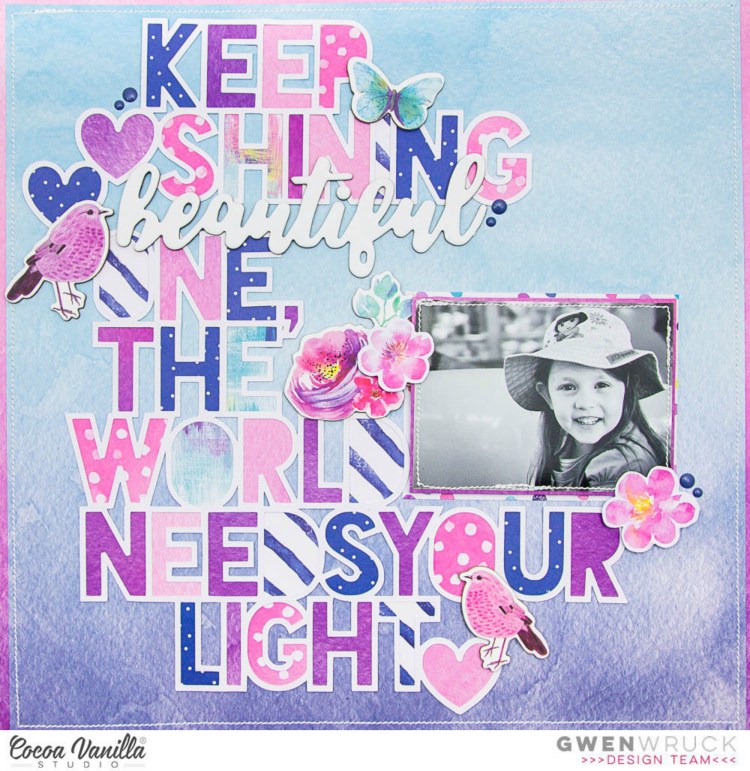
KEEP SHINING | BOHEMIAN DREAM | GWEN WRUCK

Hi Creative Friends,

Here today to share my latest Cocoa Vanilla Studios project and this week on the blog we are creating with feature titles.  I love layouts with really large titles and I haven’t done many so it was fun to give this a go.  I’ve started with a sweet little photo of my daughter from a few years back printed in a smaller size to give me space in my design for the title.  I really want my title to be the main element in my page design for this one.

I began by looking through all of the Chipboard Title Stickers from the Bohemian Dream Collection and the word ‘beautiful’ stood out to match my photo.  I really wanted a long title for this page so I went onto Pinterest for inspiration.  I found the quote “Keep Shining beautiful one, the world needs your light” and thought it was the perfect fit.

Now, that is a lot of letters to use so I thought the best way around that issue would be to create a cut file.  This one is available in the CUT to YOU shop.  I have purposely left out the word ‘beautiful’ so that I could add in the chipboard title sticker.  You can add in whatever word best fits your photo. For eg.  Precious, Clever, Handsome etc.   I backed each of the letters individually using a variety of the Bohemian Dream papers including Abundant, Abstract, Dreamer and Beautiful Mess.  Yes, this took a while, but I just love the look it has created.

I then went about matting my photo.  I’ve used more of the Dreamer paper for this as well as some of the Wild and Free paper; I chose it because it has a lovely mix of spots in the same colours as those used to back my cut file.  While I was backing my photo I noticed the stunning blue ombre on the B side which I decided to use as my background paper.  I was tempted to go white with all of the other colours going on here, but the chipboard word ‘beautiful’ stood out far better on the coloured background.

Next, I locked in the position of my large title and adhered it down.  I positioned my photo and then went to work on the embellishments.  I knew I wouldn’t need much as the page was already really coming together.

I pulled out the Chipboard Accent Stickers first, with the bulk of the page being quite flat, I wanted the chipboard to add some dimension here.  How cute are the little birdies? I hadn’t used them at all yet even though I have created quite a few pages with this collection so it was really nice to get them onto this one.  I also pulled out a couple of floral pieces from the Die Cut Ephemera pack to create a cluster to the left and right of my photo. I also added a few Enamel shapes to finish off the page.

Thanks for popping by today, and I hope this has inspired you to create something with a big bold title, lots of words that really make it a feature.  Not sure where to start?  The cut file is available in the CUT to YOU store if you would like to recreate this page.

Until next time,

MADE TO SCRAP THE AUSSIE WAY | CUT TO YOU

Hi Creative Friends,

Super excited to share that CUT to YOU is sponsoring Made to Scrap the Aussie way this month!  This fun Facebook Challenge group is a wonderful community celebrating Aussie scrapbooking businesses; how could we not want to join in the fun!  Here is the challenge for September…

As soon as I saw the flourish element in the tattoo I  just had to create a cut file inspired by the design.  I’ve called this one “Flourish” – I know, so creative 🙂

I was also really inspired by the colours in the mood board and really ran with the pink and mauve.  I wanted to try something a little out of my comfort zone just for fun and whilst it is much bolder than my usual style, I’m pretty happy with how it turned out. Here is my take!

The idea behind the page was to have the cut file be a starting point for my page design.  I wanted my photo towards the centre with parts of the file poking out above and below leading the eye across the page.  To do this, I ended up using 2 of the cuts which allowed me to run them slightly off the page from top to bottom.  I’ve coloured them with some Colour Blast Shimmer cubes just to soften their look, I was going for a subtle feature here.

I then went about creating my photo mat with paper layers and some mixed media (whipped spackle) in the background.  I’ve also added some hand and machine stitching.

It was now time to think about the title and at this point, the page was looking a little flat. It needed a pop of the black that was also in the mood board inspiration.  I pulled out the watercolour title from my stash and coloured with some Black Distress Ink.  I then went about finding some more bits and pieces of black to add in to make the page look more uniform.  I found a stack of bits and pieces from my stash to included.. lots of small details on this one!

I found this cute floral wreath from Maggie Holmes and some other little word elements that fit really well.  There are also some clear plastic hearts which have been fussy cut and then added to the page with stitching.  The white circle glitter stickers have been hanging around for a while now so it was great to get them stuck onto a page.

Lastly, I rounded out the page with some paper flowers in various sizes running along the lines of the cut file from top to bottom.  This really pulled it together and balanced everything out.

It was so fun to play along with Made to Scrap the Aussie way! this month and I’m super proud to be able to sponsor this great Aussie challenge blog so I do hope you get your entries in!

Lastly, a quick reminder that our Facebook group – CUT to YOU HQ has more inspiration from the design team and lovers of our files so be sure to join us 🙂

Until next time,

LOVE THIS | MORE THAN WORDS | GWEN WRUCK

Hi Creative Friends,

Here today to share my latest Cocoa Vanilla Studios project.  A few weeks back, some of the design team were given the challenge to create a “Geometric” themed layout.  I was so inspired by their designs I wanted to have a go at doing my own take on the ‘Geometric’ theme.  I had this photo of my sister and I which was taken recently on a day out and couldn’t wait to get it scrapped. As it was a square Instagram photo, I went with a square as my geometric shape.

I began by punching a stack of squares out of the ‘More Than Words’ 6×6 paper pad.  I also had the smallest piece of ‘Hello Lovely’ ‘Delightful‘ paper that I’ve added into the mix simply because I wanted to use it up and I knew the colours would go well together.  It was an odd shape scrap and not enough to matt my photo so punching shapes out of it was a great solution to get it used up and off my desk.  I’ve used a 1 1/4 inch square punch to do this and added them in rows on my page.  I’ve purposely left some spaces in between my rows, in part, to soften the geometric design and also to let that stunning background paper show through.  It is “Precious“, and also from the ‘More Than Words’ collection.  Once I was happy with the placement of these, I added stitched lines with my sewing machine.

I then went about matting my photo and I’ve used a small scrap from my stash of the ‘Endless Summer’ “Blue Skies” paper to do this.  I’ve mounted it on foam and also added stitching to my photo.  The pink is a slightly different tone to that of my background, however, I have a plan to use the ombre chipboard from the “Chipboard Accent Stickers” from the ‘Wild at Heart’ collection for my title and that will blend these two tones together nicely.

Once my photo was in position, it was time to embellish.  I have a couple of packs going of the ‘More than Words’ “Accent Stickers” so I pulled out both and went about getting some pieces used up.  I went straight for the pieces that say “LOVE THIS”.  I thought this could be a good way to use up two at once AND they fit that square shape design so well!  I also added my title “LOVE” from the ‘Wild At Heart’ collection as mentioned above.  I also found a couple of frames from the chipboard packs that I had not used so added them in as well, as you can see they are the perfect fit for my punched squares.

Next, I went about adding in a couple of butterflies, these ones are fussy cut from the ‘Wild At Heart’ ‘Patchwork‘ paper.  I love their watercoloured design, so soft and pretty.  I’ve also added in here a ‘flair’ from the ‘Colour Me Happy’ collection and some typed sentiments from the ‘More Than Words’ “Accessory Stickers“. The “Hello Happiness” sentiment is from the ‘Love Always’ “Accessory Stickers” which I have mounted on foam tape for dimension.

It was at this point where I loved what I had but just thought the page needed a little more.  I auditioned a few other chipboard pieces but nothing really suited.  It was then that I decided to make some small paper bows.  Again I’ve used the paper pad to do this and a die from my stash and I think they are the perfect finishing touch; I am a big fan of a bow though!

As you can see, I’ve used quite a few collections here on this one and they all go together so well.  I’ve really just stuck with a soft pastel colour palette and there have been lots and lots of options to choose from out of all of the Cocoa Vanilla collections.  I just love how even though the collections are very different, they all work together as well.

Thanks for popping by today,

Until next time,

“Perfect Day” for Scrap The Girls September 2018

Hi Creative Friends,

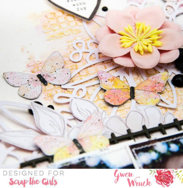
September has arrived and I’m here to share the latest challenge for Scrap the Girls.  This month we are all creating using this sketch called “Grunge Princess”.  You will all know I’m a LOT more “Princess” than I am “Grunge” but I was sure to include some mixed media ‘mess’ and some pops of black in my embellishments.  Oh yes, I also flipped the sketch upside down, just for something different.

So, here is my take!

I began with my background, pushing some Whipped Spackle through a stencil and letting it dry.  Then I’ve added a stack of Shimmerz Inklings for some shine.  I love how soft and shimmery it is.  The whipped spackle also resists it a little, so pools of colour sit in the grooves of the stencil which I LOVE!  Next up, I worked on my photo stack.  I really wanted to stay true to the sketch with the three photos as I normally only scrap with one or two. I’ve mounted each of my 3 x 4 photos onto some black and white scraps from Crate Paper and positioned in a messy row.

I’ve also added in a few layers of Pink pattern paper here as well just to add to my paper stack.

At this point, it was all looking a little soft and pretty but a little wishy-washy (is that even a word??) – I mean, a little pale, and needed a pop of “something”.  So, going back to the inspiration this month, I pulled out some black elements to add a touch of “grunge”.  The chipboard pieces were a great match with my stencil, I simply coloured with some black Distress Oxide Ink.  I also had the title piece ‘perfect’ from Cocoa Vanilla Studios.  I love these as they are more a dark grey than deep black and suited this project perfectly.

I then took the Floral Cluster 01 Custom cut file from the CUT to YOU store and added that as another background element to my page.  I used the sketch as a guide and added in where the marked mixed media should be.  I was never going to add a big paint splatter to the back of my page, that’s just not my style, but the cut file, with my background mixed media added in the same position draws the eye across the page in the same way as a paint splatter would.

Here you can see how the cut file sits on top of my mixed media and adds a lovely layer to the page.

The bones of the page were coming together now, it was time to add in a few more embellishments.  I’ve gone with some fussy cut butterflies.  I especially love how these match my colour scheme including a little pop of black for their bodies.

I also found a few other bits and pieces going through my stash, this black and white heart and pink paper flower.  These challenges always allow me to use up my stash of goodies and I love mixing and matching a stack of collections and manufactures for these pages.

I also found this cute little fabric bow in my stash and some black enamel dots and that was the page done.

I love how this page turned out… I know it is hardly “grungy” however, I was really inspired by the “grungy” components of the sketch to add a real pop to my page and it was so fun to work with AND, I love how it turned out.

Be sure to upload to the Facebook group for your chance to win a fab prize from our sponsors – I would love to see what you create!

This months sponsor: Colour Blast

Until next time,


error: